Discover the meanings hidden in the logos of 8 famous brands
We are used to seeing the names and logos of many famous brands every day: they can be on clothing, objects that we use every day, apps or even foodstuffs that we eat. They are such well-known images that they are immediately recognisable.
But have you ever wondered why a company or brand chose the logo they did? The shapes and the colors? Sometimes, the choice is intuitive; at other times, it has hidden meanings which can be understood only after having taken a more in-depth look at them. Here are eight well-known logos explained:
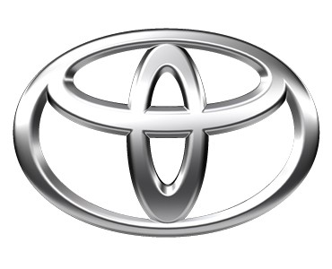
Toyota is a well-known Japanese car company. In the logo, we all recognize the "T", the initial of the company name, but why does the logo have two intersecting ellipses? The shape of the letter is intended to look like a steering wheel. And they are inscribed in an oval, which represents the earth/world that Toyota operates in. There are even those who have managed to see all the letters that make up the word "Toyota" in this logo!
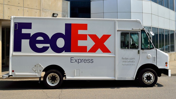
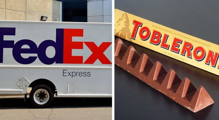
FedEx is one of the most famous international couriers in the world, and its logo is quite simple: the two words side by side, with the final "d" of the first and the initial "E" of the second leaning against each other. But have you ever noticed that the white space that is formed between the "E" and the "x" has the shape of an arrow pointing forward?
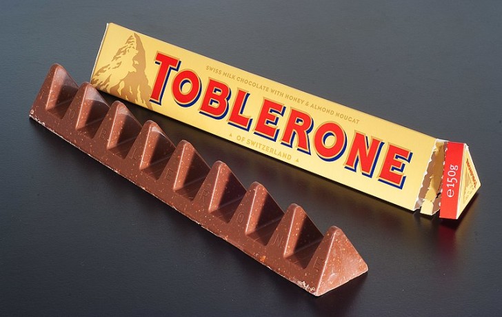
Among the most loved treats in the world is Toblerone, a chocolate bar that resembles an Italian nougat product. This Swiss reinterpretation of the traditional Italian product is indicated in the name, which is a portmanteau between "Tobler", the inventor's surname, and "torrone" (Italian for "nougat"). This type of chocolate is famous for its shape: multiple triangles in a row, which look like mountains in the logo. But if you take a closer look at the mountain drawn on the packaging, you'll notice that the shadows and shading in the snow on the rocks actually hides the shape of a bear, the heraldic symbol of Bern, the city where Toblerone comes from!
Airbnb, Inc. - Creativo
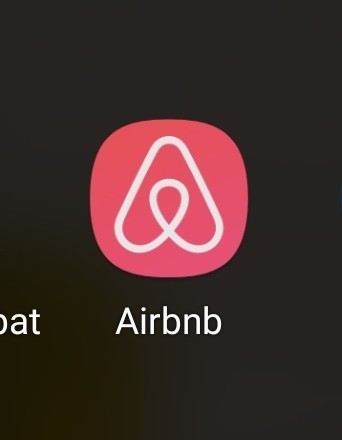
The holidays of many people in the world are facilitated by the use of this very popular app: Airbnb. This app allows you to find accommodation of types. The logo a paperclip in the shape of an "A", the initial of the company, but in reality it is the blending of four symbols: in the center is the head of a customer, with their arms outstretched and curved upward; the central shape is the symbol of the position of any place on a map; then, by turning the logo upside down, a heart is formed, to symbolize belonging and conviviality; finally, the "A" is probably the first thing you see.
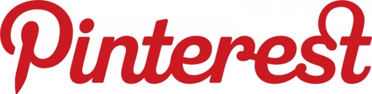
Pinterest is amongst the best-known social networks, born as a bulletin board on which to pin ideas of any kind. And in fact, the initial "P" looks like a pin that is used to attach sheets to a cork bulletin board!
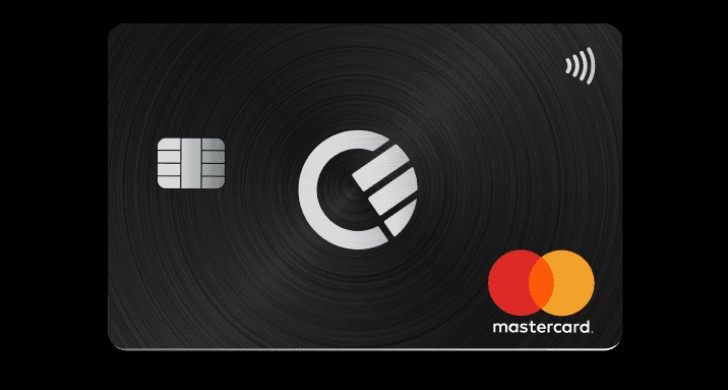
One of the most popular payment systems in the world is Master Card, whose logo appears on many bank cards. It consists of two intersecting circles, one red and one yellow, and where they overlap, the color is orange. Why exactly those two colors? Red symbolizes energy and passion; yellow represents prosperity.
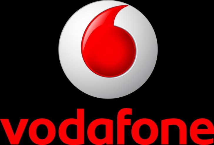
Vodafone is an international communications company: the shape of the red "comma" of their logo is actually a quotation mark like those which, in punctuation, indicates the beginning of a conversation!
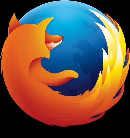
Firefox is one of the oldest and most used browsers in the world: in the logo we see a fox embracing the world. But in reality, this is not exactly a common fox. "Firefox" is the English word that from the Chinese word for the red panda, an animal at risk of extinction.
It is really interesting to discover the reasons that lead to how logos are designed!