Do you want a dark decor in your home? Discover the most beautiful shades to give character to your surroundings
Despite technically being a neutral color, black is often not used (or is used sparingly) in interior design decors. And while blues, greens, or browns are used, managing these when they are too dark can be challenging.
Using dark colors can reduce brightness in an area, and that's why they dark colors are used in moderation. However, in recent years, there's a growing trend to incorporate dark colors into interior design, both for larger spaces like living rooms, bedrooms, and kitchens, as well as smaller areas, such as bathrooms or offices. So, which dark shades are particularly popular these days in the design world? Well, keep reading:
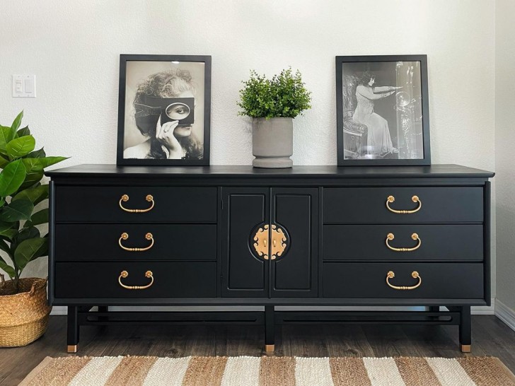
Off Black 57 (Farrow & Ball)
Farrow&Ball/decoetcompagnie.com
Surprisingly, this remarkable color is a shade of black. It may not appear entirely black because it has a blue undertone, giving it a hue which is closer to slate. This slate-like color is proving popular and that's why Farrow & Ball has introduced a shade called "Off Black," - a black with a subtle undertone. This color is versatile and suitable for covering furniture and walls. Many appreciate it as a backdrop for photo galleries or paintings, and it's also a popular choice for painting brick fireplaces!
Limousine Leather MQ5-05 (Behr)
In contrast, this black is much more distinct, and its name - chosen by the paint company Behr - suggests the luxury it's meant to convey: picture the deep, glossy black of leather seats in a limousine. There are no blue or brown undertones, and when you look at this color (especially in satin finishes), it gives the impression of looking into a void.
It's a popular choice for furniture, and it's also used to create graphic effects, paint doors, or add elegance and drama to a bar corner. Some even appreciate this black in the bedroom, particularly for the wall behind the headboard.
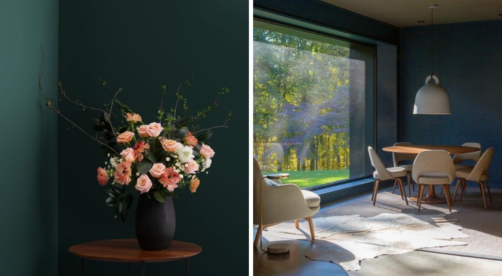
Black Forest Green HC - 187 (Benjamin Moore)
Green, especially in its dark and intense variations, is currently enjoying widespread popularity in the realm of interior design. The reason is simple: transitioning from black to a deep green provides the opportunity for a broader range of combinations that still exude warmth and a natural feel. If the chosen shade leans towards cooler tones, it opens up possibilities for a more ultra-modern decor. The contrasts achieved with green are never as sharp and distinct as those with black.
Benjamin Moore's intensely dark forest green is essentially a black with a subtle dark green undertone. When illuminated, it takes on warmer tones, but in the dark, it resembles black ink.
Gentleman's Gray 2062-20 (Benjamin Moore)
@mowerymarsharchitects/Instagram
It's crucial to mention a shade of blue, as it has always been the favored option for those seeking dark colors without venturing into the extreme darkness of black. One of the most beloved hues is Benjamin Moore's Gentleman's Gray. It complements brighter and more vibrant colors, yet it also pairs perfectly with neutral and soft tones.
This makes it ideal whether you're embracing the trend of "shimmering gemstone colors" or aiming for a more restrained and classic ambiance. In essence, it allows for complete personalization without the risk of monotony!
London Clay (Farrow & Ball)
Now, let's explore a warm brown hue with a touch of violet: Farrow & Ball's London Clay. It's warmed by reddish undertones, avoiding the risk of becoming overly vibrant like burgundy (which has also become trendy lately). This shade complements white, dusty pink, warm green, and the light hues of wood. In essence, it's another versatile option that shouldn't be overlooked.
Which of these nuances is your favorite?